One of my Professors asked me to help an Anthropology Ph.D. student, Anders Wallace, with his dissertation topic, pickup (dating) community analysis. Looking for more text processing experience, I was excited to help. However, neither of us knew much about the community. Furthermore, neither of us knew what to look for. Hence, the title is “War Story” to emphasize the challenge (the title idea came from Professor Steven Skiena’s book, “The Algorithm Design Manual,” which is known for “War story” series). So, here I am one week later wondering how to proceed with the task.
First of all, Anders made our life easier by finding a big archive of “fastseduction.com” forum data. The data is unstructured post lists from different users. On the one hand, this was a good start, on the other, the data was a total mess.
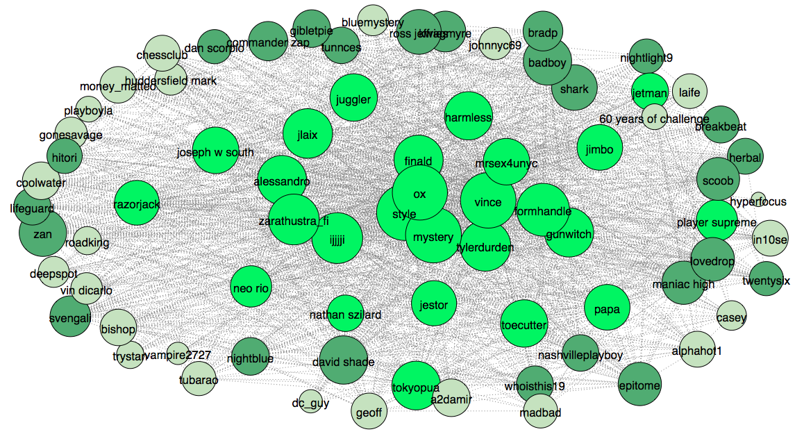
To start, I decide to take a quantitative/hands-on approach to find interesting questions that will help Anders. One way to find good questions and to understand the community is visualization. Using python and networkx library, I start looking at how users connect to each other. A graph is a perfect visualization for such problem. The forum users are converted into nodes and edges represent connections to other users. In order to do this, the data needs to be parsed to find cross-referencing inside the posts. The nodes size varies depending on the number of edges, times a user was mentioned by others. The graph is plotted with matplotlib python library.
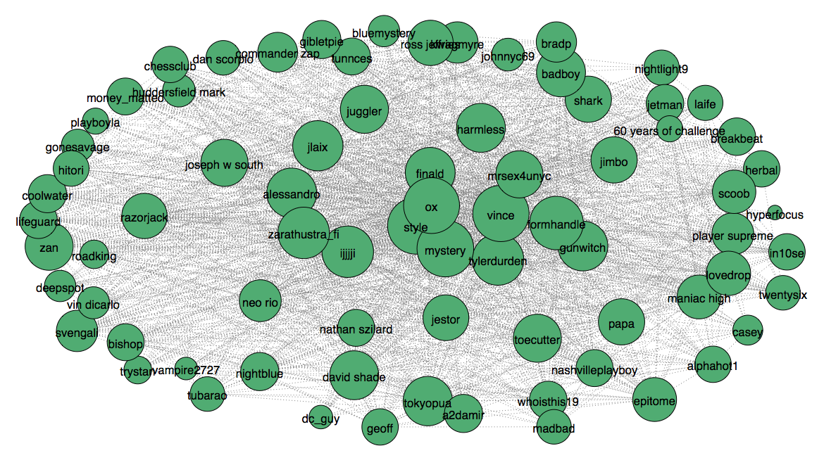
From the graph, we can see that community is very dense. Most people interact with each other a lot. However, some users have more connections than the others. This fact can be used to understand who has more influence, find subgroups inside the community. Nevertheless, at this point it is a good idea to use natural language processing for deeper analysis. To start, I look at word counts. This will give us an idea how the community developed through the years. For this job, a simple bar chart visualization will suffice.
This plot shows pickup community life starting in 1995 – when Neil Strauss published his NYTimes bestseller “The Game” bringing attention, till 2008 – when “fastseduction.com” was closed. A particularly curious question can be is to see what caused popularity spikes in 1999, 2002, 2004 and decline in 2007.
Another interesting questing can be is to understand who was participating in the forum life and what was their education level. Since a common pickup artist image is an uneducated guy who is interested in dating as many girls as possible. Let us see if this image holds. The following bar chart shows the number of unique stemmed words, vocabulary size, each user used in his posts.
Considering that on average college-educated native English speaker has a vocabulary size of 17,200 words , some users show very high level of education. Keep in mind that this chart is subjective to a number of written posts. This is why next bar chart provides a ratio of a vocabulary size over the total number of words written.
This chart moves users from the tail of the previous chart to the beginning providing that the users with a small number of posts have a high ration of vocabulary size over written text amount. We don’t know for sure, but it can be the case that given a larger text input from the users their vocabulary size can be quite large. We can see that community members come from different backgrounds, including high education.
What is more interesting, is to look at the different community states. For this task, Anders brought to my attention a notion of mental states (flow zones) defined in positive psychology. He hand-picked relevant words from top word counts. Since we didn’t care much about precision, but general rather trends, the best way to visualize the trends through the years is stacked area plots. It lets us see the trends through the time without dealing with numbers. All data was normalized. In total here are six distinct plots.
From these plots we can see how the community was changing through the time. In the firs plot, learning system, during the first year the word “teachers” lost it’s battle to more favorable “masters”. In the second plot, “game” had two significant spikes. The third chart shows rise of “frustration” in the later years. We can go on and on forever. A keen person can find hundreds interesting patterns that can evoke many questions, so lets leave this task to Anders.
Another thing that we should consider while looking at the psychological states is sentiment. Sentiment represent writer’s opinion or view on the subject. Since we know community specific subject, we can plot yearly sentiment.
It appears that the forum experienced ups and downs. Surprisingly, the last couple years, before the forum closed, were the most positive years. How about the users’ sentiment?
The majority of forum users had positive sentiment, with an exception of few members. It is hard to tell why some people project more positive sentiment than the others. One theory states that more powerful (influential) users tend to be less positive (polite) in their statements. A team at Stanford University investigated this and found that this is indeed true. They looked at online Wiki talk pages and StackOverflow forum. For more info refer to the paper: Danescu-Niculescu-Mizil et al. “A Computational Approach to Politeness with Application to Social Factors.”
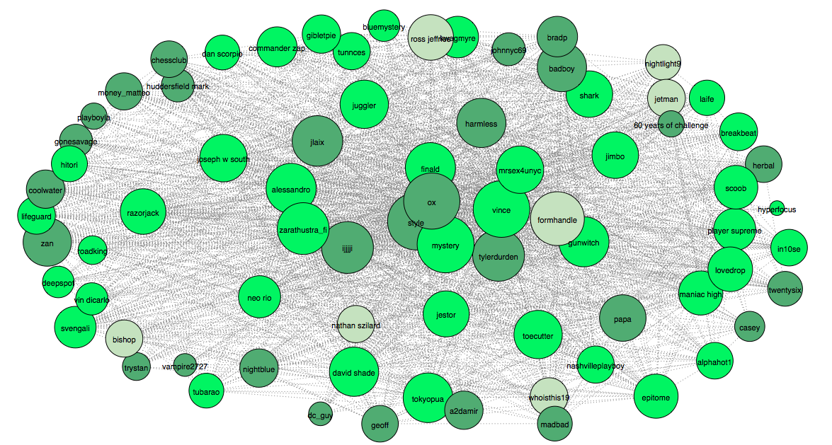
In order to implement such analysis, we need to have either some kind of community ranks or a good understanding who is who. Since we don’t have any insights about the hierarchy, we can apply heuristics to approximate users’ status. From the graph above we noted that the connections are very dense. We can hypothesize that high hierarchy users must be interconnected in such dense graph. In other words, we need to find maximum clique – think largest social clique. After running some simple algorithms, it turned out that maximum clique contains 25 users. This is who the clique members are:
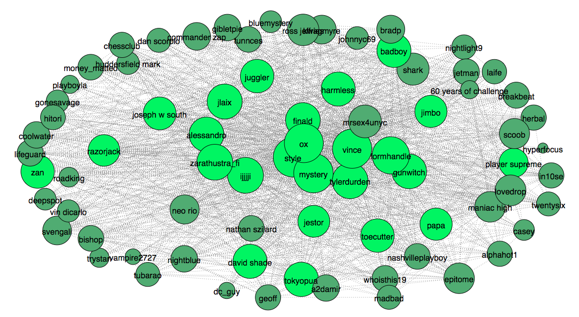
This looks about right. Most nodes with high degree, connection number, ended up in the clique. However, this is just a good guess that we should verify with another heuristic. This time I will apply an algorithm to measure centrality. The algorithm used for this job is eigenvector centrality, you can think of it as a simplified version of page-rank (used by Google). After running the algorithm I plot 25 top ranked users to compare with our previous heuristic, clique.
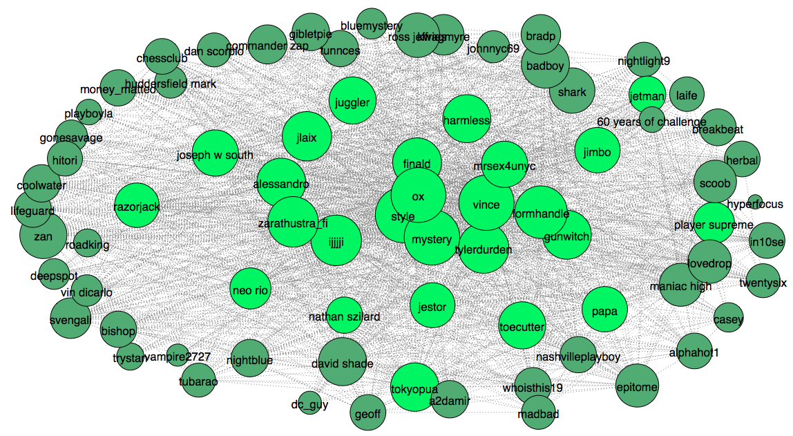
Surprisingly, top ranked users highly overlap with previously extracted clique, with the exception of 2-3 users. For the next step we plot low rank 25 users and add them to the graph (light green).
Now we can compare the users in terms of their status inside the community and how it reflects on their behavior. In particular we look how sentiment and pronoun use differs. Similar to sentiment, pronoun use is known to be different throughout hierarchy levels. In my work on interpersonal relationships and hierarchy detection we saw that people with high status tend to use third person pronouns more than self referring pronouns. It is interesting to see if this holds here too. Below you can see two bar plots, ratio of self pronouns over third person pronouns and sentiment.
The plots confirm that both our theories are applicable to pickup community. Interestingly, while sentiment shows hight correlation, steady increase, with predicted status levels, pronoun use is the lowest in the middle status subgroup. This can be due to the fact that our sub-group division is subjective. We arbitrarily decided to split the users in to three groups by 25 users. We could have split the community into two sub-groups as well, or chose not equal user distribution. However, even with such subjective division the results are fascinating. It would be interesting to see why such correlation exists. Is it because users with low status ask more senior users for advice, hence we see such shift toward increase of “I” and “my” pronouns? Or it is the case that low status users are more insecure?
These questions evoke more questions: how does each member uses words? Does it change with through hierarchy? It sounds like the right problem for 2D heat-map (small advise: try to avoid 3D data representations). The heat-map show top stemmed words (omitting stop words) with respect to each user. The users are ordered by their hypothesized hierarchy score.
At first the histogram might seem a mess, but it reveals many curious facts. We can spot that a word “chick” used predominantly by top users. Also, there are a few obvious outliers (in yellow-white) that show individual language patterns.
This bring us to the next question: do users mimic language style from each other? To find out I need to create a unigram feature vector for each user. The vector consists of 1000 most frequently used words, including stop words. Then I need to run k-mean clustering. In order to stick with our arbitrary user division, in the algorithm k = 3. Here is what we get:
If users do mimic writing style, they obviously don’t do it from members of the same hierarchy level. It is totally plausible that writing style is influenced by their role-models or people they communicate the most. Whatever the reason is, it’s beyond the scope of this short exploratory analysis. We already discovered more questions than was intended. Hopefully, Anders will find all the right answers and we will learn more about pickup artists and the community from his dissertation.